Role: Product Design Lead
Timeline: 2021 to 2024
Platform: Web to Flutter based Mobile App
Industry: Digital Health and MedTech
Status: Reached user testing with strong qualitative feedback. Product wound down following a funding contraction.
Mommyato is a digital health platform built for first-time mothers navigating pregnancy. Not for the questions they are already asking. For the questions they do not know to ask yet.
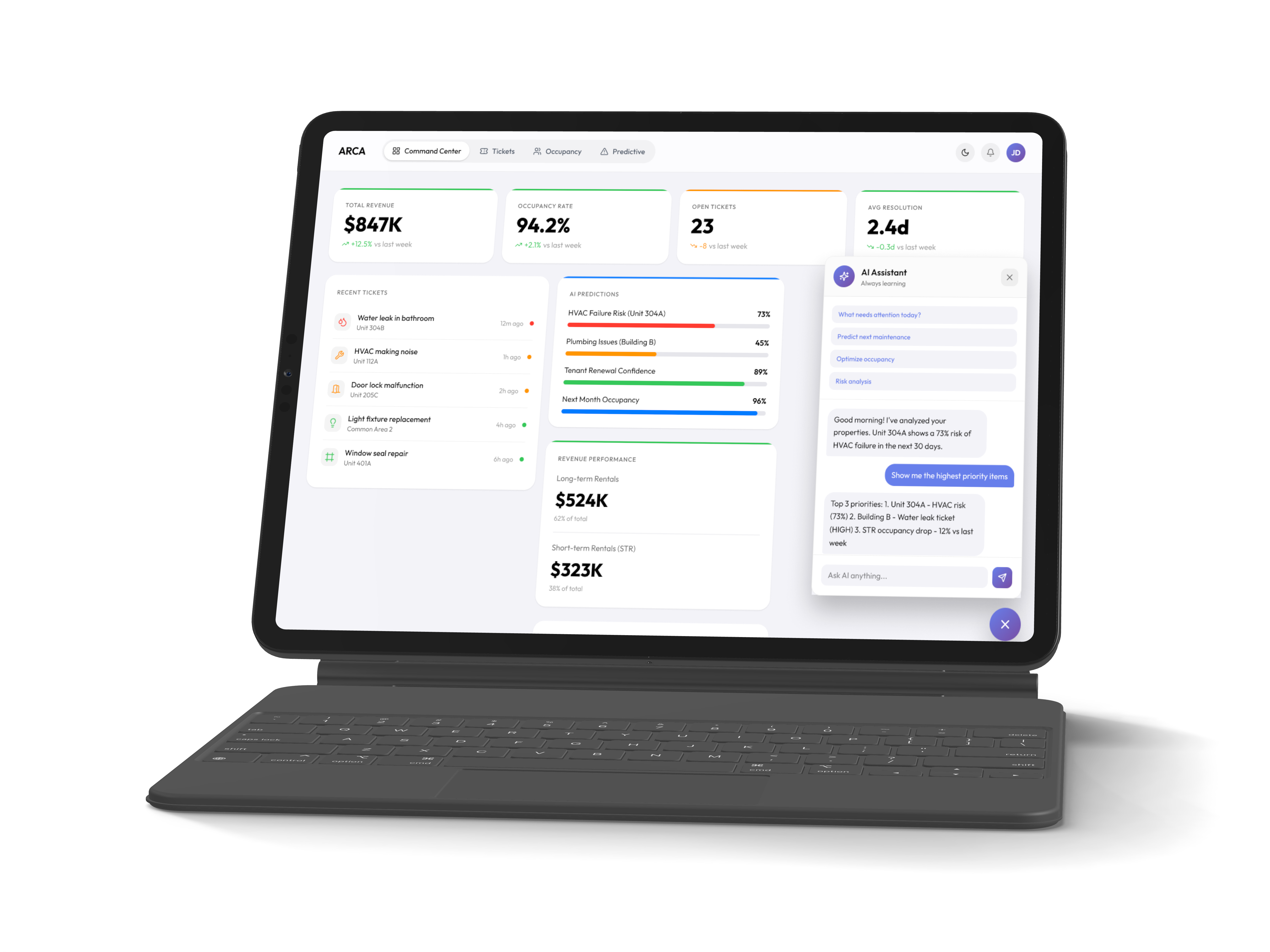
I joined in 2021 as a Product Designer and grew into the Product Design Lead role over three years. My work spanned the original web product and a full transition to iOS and Android driven by research showing users wanted what Mommyato offered but would not engage with it as a website.
The core design challenge was unusual. How do you architect information for a user who does not know what she does not know? That question shaped every decision we made. Users needed a product that anticipates the gaps in their knowledge and surfaces the right information before they think to ask for it. That required rethinking the entire information architecture from the ground up rather than just translating the web experience to mobile.

.png)
The decision to move from web to mobile did not come from a business assumption. It came from watching real people try to use the product.
Early research made one thing clear immediately. Mothers wanted what Mommyato offered. They were not disengaged from the content. They were disengaged from the format. A website required intention. It required sitting down, opening a browser, and seeking something out. Pregnancy does not work that way. The questions come in the middle of the night. During a commute. Between contractions of anxiety that arrive without warning. The product needed to be where mothers already were.
That single insight drove the platform decision. Mobile was not a feature request. It was the only honest response to how people were actually living.
Before any design decisions were made we needed answers to questions that went beyond usability.
What does a first-time mother actually not know? Not what she searches for. What she does not know to search for at all.
Where does anxiety live in the pregnancy experience and what triggers it?
What does she trust and why? Medical authority? Peer experience? Something else entirely?
How does she consume information when she is overwhelmed, exhausted, or scared?
These were not questions a standard usability study could answer. They required a different kind of listening.
We conducted interviews with first-time mothers across different stages of pregnancy and the postpartum period. We talked to mothers who had recently delivered to understand what they wished they had known earlier. We interviewed doulas and OBGYNs to map the clinical gaps between what mothers believed and what was medically true.
We surveyed mothers specifically about the postpartum experience. What surprised them. What blindsided them. Where they wished someone had told them something sooner.
We observed how mothers used the existing web product. Not just what they clicked but where they stopped. Where they left. Where they came back.
We tested early concepts with real users and watched what landed and what did not. Some of our strongest assumptions did not survive contact with actual mothers.
The product felt wrong before it said anything.
The web product's visual language was the first problem. Mothers described it as cold and intimidating. Clinical in a way that felt distancing rather than reassuring. At a moment in their lives defined by vulnerability and emotion the product looked like a medical form.
This was not a minor aesthetic note. It was a fundamental mismatch between what the product was trying to do and how it made people feel the moment they opened it.
Mothers do not know what they do not know.
This was the most important and most difficult finding. First-time mothers are not searching for specific answers because they do not yet know which questions to ask. The gap is not access to information. It is awareness that the information exists at all.
A search bar is useless if you do not know what to type. The product needed to anticipate the question before the mother thought to ask it.
Interruption is the default state.
Every mother we spoke to described the same pattern. Starting something and not finishing it. Not from disinterest but from the reality of pregnancy and early parenthood. A workflow that required an uninterrupted thirty minutes was a workflow most mothers would never complete.
The product needed to be designed around interruption as the expected condition not the exception.
Emotional resonance was a product requirement not a nice to have.
Mothers were not just looking for accurate information. They were looking for something that understood what they were going through. The products they trusted most made them feel seen not just informed.
This had direct implications for tone, visual language, interaction design, and content architecture. Warmth was not decoration. It was function.
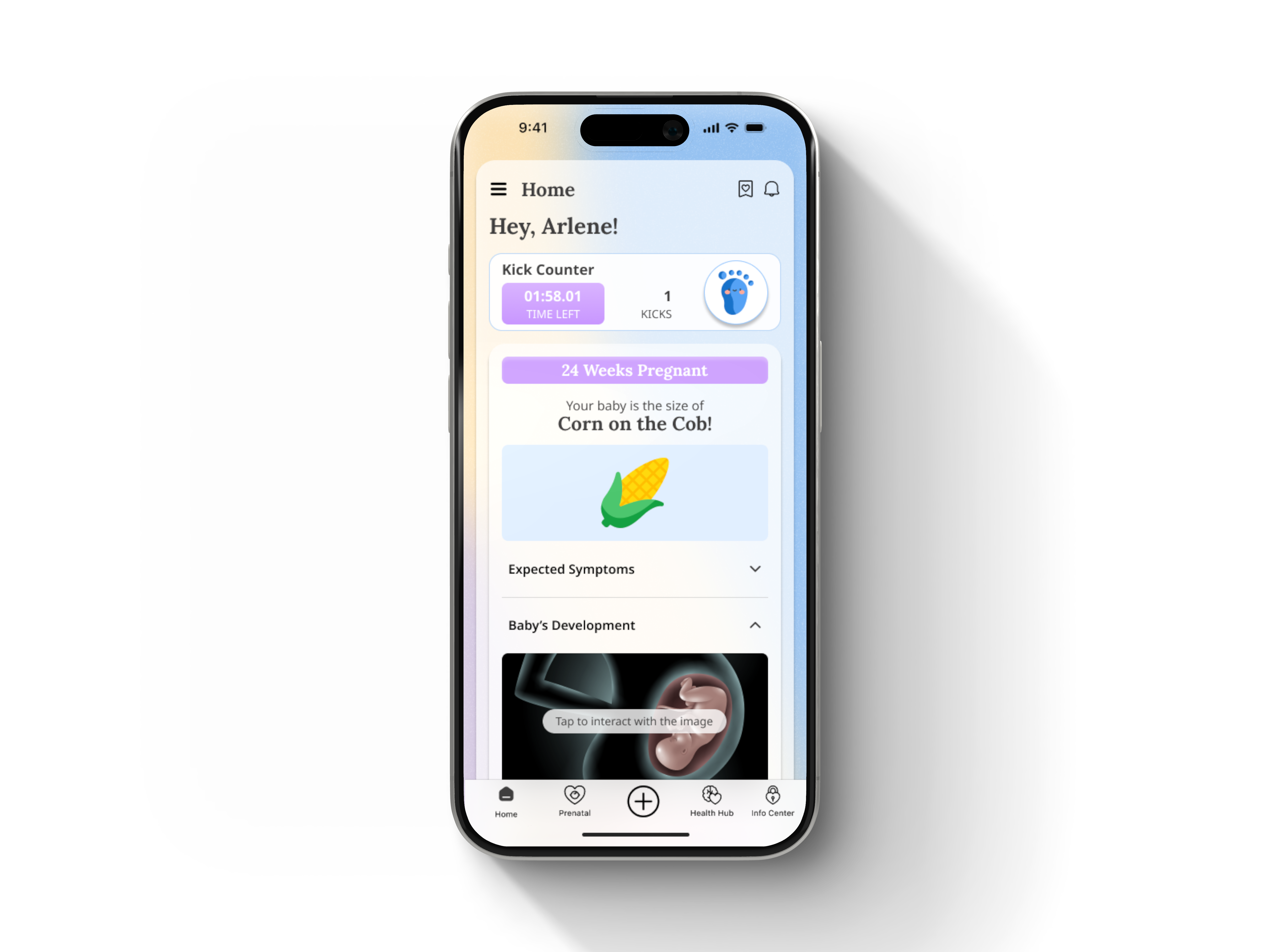
The baby was the center of everything.
Almost universally mothers described their relationship to the pregnancy through the baby. Not through symptoms or milestones in the abstract but through their specific baby at their specific stage. Seeing the baby. Understanding what was forming. Knowing what was happening inside them.
This insight shaped one of the most central design decisions in the product. The baby visualization was not a feature. It was the emotional core the entire experience was built around.
By the end of discovery we had a clear picture of what the product needed to be.
It needed to feel warm and human before it said a single word. The visual language had to close the emotional distance the web product had created.
It needed to surface information proactively rather than waiting to be searched. The architecture had to work for a mother who does not yet know what she needs.
It needed to be designed around interruption. Every workflow had to save state, surface progress, and make it easy to pick up exactly where she left off.
It needed to put the baby at the center. Not pregnancy in the abstract. Her baby, this week, right now.
And it needed to feel low pressure. Mothers were already overwhelmed. Every interaction had to reduce cognitive load rather than add to it.
These findings did not suggest refinements to what existed. They required building something fundamentally different.
.png)
We did not iterate on the web product. We replaced it.
That decision was not made lightly. Rebuilding from scratch meant starting over on everything. Visual language, information architecture, interaction patterns, content structure. It meant accepting that what existed was not a foundation to build on but a constraint to escape.
The research made it unavoidable. Mothers were not struggling with specific features. They were struggling with how the product made them feel before they had read a single word. Cold. Clinical. Distant. Those were not usability problems. They were trust problems. And you cannot fix a trust problem by moving buttons around.
Everything that followed came from that first decision.
The new design system started with a single question. What does safety feel like visually?
Not medical safety. Emotional safety. The kind a mother feels when someone who understands what she is going through sits across from her and says you are going to be okay.
Hard lines became soft curves. Navy and white became pastels and warm backgrounds. Every corner was rounded. Blob shapes and custom illustrations replaced structured grids and stock photography. The logo was redesigned. The visual language was rebuilt from the ground up around warmth, approachability, and humanity.
This was not aesthetic preference. Every decision traced directly back to research. Mothers had described the web product as cold and intimidating. The redesign was a direct response to that feedback. When the visual language changed the emotional response changed with it. Mothers who had described the web product as clinical described the new design as something they actually wanted to open.
That is what a design system is supposed to do. Not just create consistency. Create a feeling.
Research surfaces what matters. Sometimes it surprises you.
The week by week baby visualization tested as a nice-to-have in early research. A pleasant feature. Useful but not central. We almost treated it that way.
Then we watched mothers use it.
The moment a mother saw her baby represented at her specific week, understood what was forming, what symptoms to expect, what her baby could now sense, something shifted. She stopped being a user navigating a product and became a mother connecting with her pregnancy. She shared it with her partner. With older children. With her mother. It became a ritual.
We did not tuck it into a corner. We built the home screen around it.
As the baby developed week by week mothers could explore a 3D representation, understand developmental milestones, and track exactly what was happening inside them in real time. It was interactive, deeply personal, and unlike anything else in the product.
What initially looked like a feature turned out to be the emotional core of the entire experience. The lesson was not that we got it right the first time. It was that research can only take you so far. Sometimes you have to see a mother use something to understand what it actually means to her.
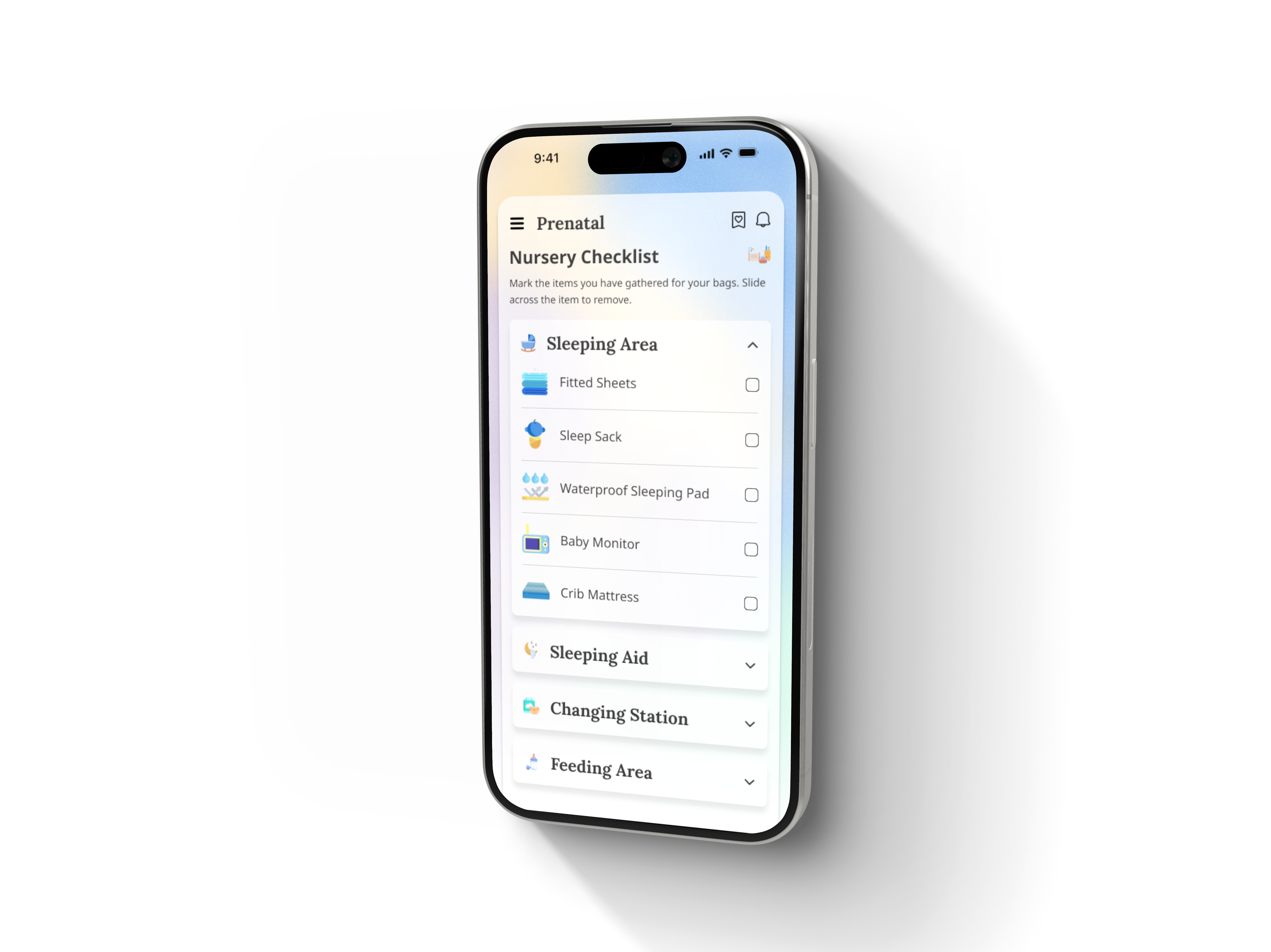
The birth plan. The hospital bag. The postpartum plan. The breastfeeding guide. The sleep training guide.
Every one of these existed in some form before we redesigned them. Articles. Checklists. PDFs. Walls of text that were technically complete and practically useless.
Mothers knew the information existed. They were not engaging with it. The problem was not content. It was delivery.
We rebuilt every workflow around a single principle. One decision at a time. Never passive. Always interactive. Always completable.
The birth plan walked mothers through every decision they would face in the delivery room. Comfort preferences. Epidural choices. Who they wanted present. Whether they wanted music or specific lighting. Gender reveal preferences. Vaccination timing. Cord clamping. Each item appeared individually. Each could be answered with a partner. The completed plan exported as a PDF that could be shared directly with their doctor.
The hospital bag broke packing into three distinct categories. For the baby. For the mother. For the partner. Checklists that could be completed directly in the app with reminders that escalated as the due date approached.
Postpartum planning went further than any competitor had gone. Who would cook the first few days. Who would handle cleaning. Breastfeeding guidance with posture instruction. Formula alternatives for mothers who chose a different path without judgment.
What made these workflows different was not the content. It was the pacing. Progressive disclosure at its most human. Mothers finished these workflows in a single sitting. They consistently said they had not expected to. That surprise was the signal that we had gotten the pacing right.
The hardest design problem in the product was also the least visible one.
Mothers were not failing to find information. They were failing to know which information to look for. A search bar is useless if you do not know what to type. A library is useless if you do not know what you are missing.
Research had surfaced this clearly. We surveyed mothers about what had blindsided them postpartum. What they wished someone had told them before it happened. We interviewed doulas and OBGYNs to map the gap between what mothers believed and what was clinically true. That research did not just inform the content. It became the content architecture.
The resource center had two modes designed for two different states of mind.
When a mother did not know what she needed the personalized homepage found her. Articles surfaced based on her specific stage, her medical history, her conditions, her onboarding assessment. Content that arrived before she thought to ask for it. Content that knew where she was in her journey and met her there.
When a mother knew what she was looking for the fully searchable library gave her control. Browsable by topic, stage, or keyword. She could explore on her own terms.
Personalization went deeper than most products attempt. Onboarding assessments captured prior C-sections, existing medical conditions, known fetal conditions, and other factors that shaped what information surfaced and when. Those assessments were not fixed. They could be updated throughout the journey as circumstances changed because pregnancies change.
The goal was a product that knew more about what a mother needed than she did. Not in a way that felt intrusive. In a way that felt like someone was paying attention.
Not every design decision is made in the absence of resistance. Some of the best ones are made because of it.
A health habits feature built around a swipe interaction generated significant internal pushback. The concept was simple. Mothers were presented with health habits one at a time and swiped right if they felt the habit was positive for them or left if they were unsure. The swipe did not score or judge. It surfaced information and resources related to each habit and closed with an overview of everything covered.
The pushback was immediate and predictable. It felt like a game. It felt experimental in a product that was supposed to be taken seriously. The concern was legitimate. Healthcare is not Tinder.
It tested better than almost anything else we built.
Mothers found it intuitive before we finished explaining it. Swiping was already a native behavior. They did not have to learn anything. The interaction was fast and low pressure. It did not feel like a test. Because they were actively engaged rather than passively reading the information landed in a way that lists and articles had not managed.
They moved at their own pace. They returned to it without losing progress. They finished it.
I defended this design when it was questioned internally and I would defend it again. The research was clear. The interaction pattern served the content. The fact that it felt like a game was precisely why it worked. Engagement is not the opposite of seriousness. Sometimes it is the only way to achieve it.
The lesson was not that unconventional interactions are always right. It is that research earns you the confidence to hold your position when the room pushes back.
One finding came up in almost every research session. Mothers started things and did not finish them.
Not because they lost interest. Because they were interrupted. By nausea. By exhaustion. By a phone call. By a toddler. By the unpredictable and relentless reality of being pregnant.
A product that could not survive interruption was a product that could not serve this audience. So we designed interruption in from the beginning rather than treating it as an edge case.
Unfinished tasks surfaced directly on the homepage. Mothers never had to remember where they left off because the product remembered for them. Workflows saved state at every step automatically. Progress indicators were persistent and visible throughout the experience. The product never required a mother to start over from the beginning.
This sounds like a technical requirement. It was actually a design philosophy.
The assumption most products make is that users have the time and attention to complete things. For this audience that assumption was wrong almost every time. Designing around it meant accepting the reality of our users lives rather than the idealized version of engagement we might have preferred.
The product that respects interruption is the product that gets opened again. That was the goal.